Clarice Cliff, Designer and Industrialist

A Clarice Cliff Fantasque Umbrellas and Rain pattern seven-piece sandwich set, circa 1930

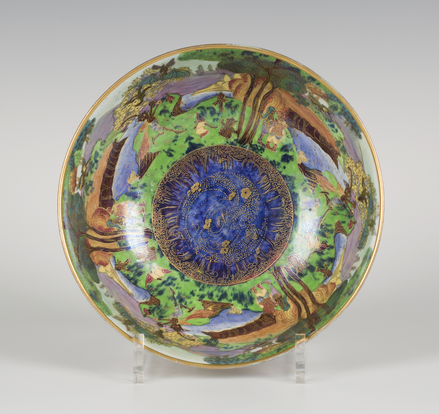
This week we are returning to the story of Clarice Cliff, one of the most influential women designers and industrialists of the 20th century. Born in 1899 she grew up in Tunstall. Her father worked in an iron foundry whilst her mother took in washing.

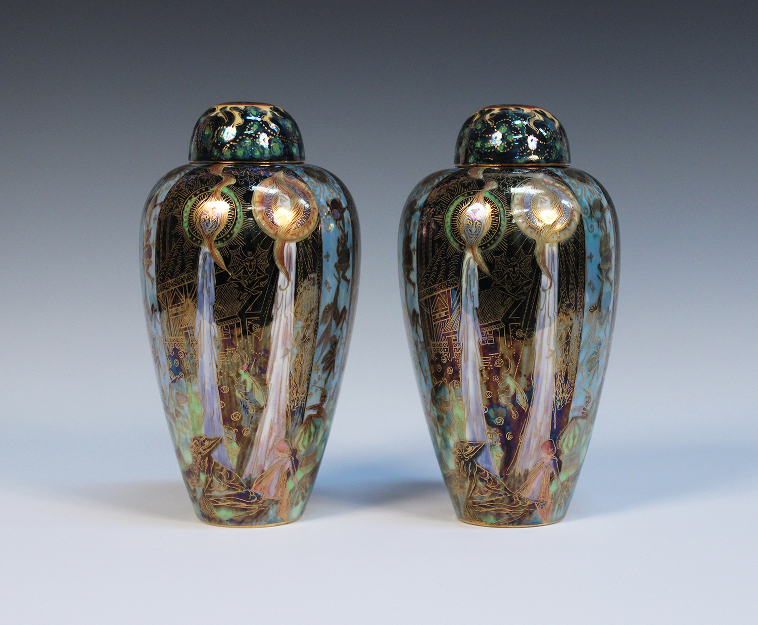
When she was thirteen Clarice Cliff started working in the pottery industry as a gilder and studied art and sculpture at the Burslem School of Art. Clarice Cliff’s talent was acknowledged by Newport pottery and A J Wilkinson who gave her a studio in 1927. It was here that she began to paint her free hand patterns employing on-glaze enamels which were much brighter than underglaze colours. Her wares were immediately popular. She called her work Bizarre and ‘The Bizarre by Clarice Cliff’ stamp was used between 1928 and 1936.

In 1930, Clarice Cliff, with talent and determination rose to the position of art director of the Newport pottery and A J Wilkinson

Despite the financial pressures of the Great Depression and the high price of her wares Clarice Cliff‘s Bizarre ware continued to sell in volume across the world in leading department stores. Her ability to model allowed her to embrace the modern influences from Europe.

A Clarice Cliff Bizarre Sunray pattern jug of tapering form, circa 1930

Clarice Cliff had a strong interest in modern art and her modernist designs were influenced by Cubists like Henri Matisse, De Stijl, Sonia Delauney and the French design firm La Maison Desny. She collaborated with many contemporary artists including Dame Laura Knight, adapting their paintings for her pottery.

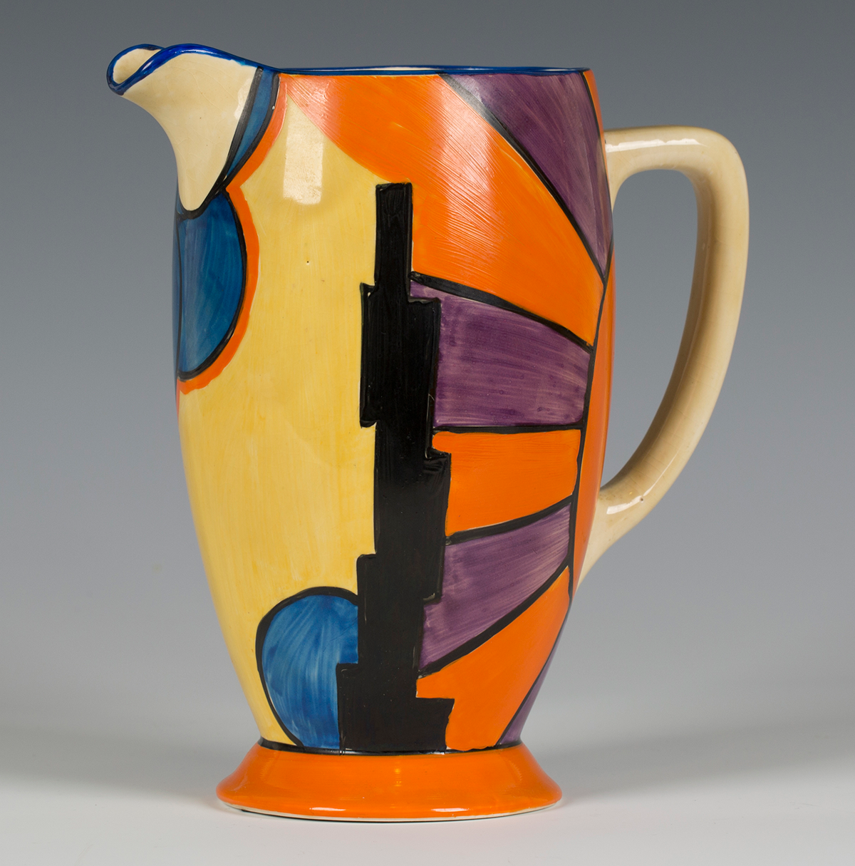
These bold new artistic styles informed her colourful cubist landscape designs. The Bizarre Sunray pattern jug is typical of Clarice Cliff during this period. It dates from around 1930. The abstract landscape design is based on a New York skyline and features a bold black skyscraper. It realised £500 at Tooveys.

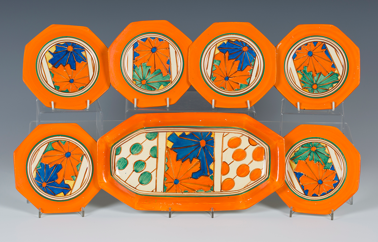
The vibrant, exquisitely conceived Clarice Cliff Fantasque Umbrellas and Rain pattern sandwich set from 1930 brings together the influences of modernist art and the art deco. It was sold for £700 at Tooveys.

The first retrospective of Clarice Cliff’s work was held at the Brighton Museum and Art Gallery in 1972. Today, women artists and designers are being reassessed as the often overlooked stories of these important women artists, designers and entrepreneurs in the 20th century are reclaimed.

If you would like advice on collecting or acquiring Clarice Cliff Bizarre ware contact Toovey’s specialist Jo Hardy by telephoning 01903 891955 or emailing auctions@tooveys.com.

Eric Ravilious – Sussex Artist and Designer

A Wedgwood Elizabeth II coronation cup, circa 1953, designed by Eric Ravilious

The artist Eric Ravilious lived and worked in Sussex. Known primarily for his watercolour landscapes and wartime studies, Ravilious was also a talented illustrator and designer.

Eric Ravilious was born in 1927. As a very young boy he moved with his parents from Acton to Eastbourne in Sussex. There his father ran an antique shop. Ravilious was educated at Eastbourne Grammar School. In 1919 he won a scholarship to Eastbourne School of Art and in 1922 to the Royal College of Art in London, where he met his lifelong friend and fellow artist Edward Bawden. Both men studied under the artist Paul Nash, who was generous in encouraging and promoting their work. Ravilious subsequently taught part-time at both art schools.

In the early part of the 20th century there were attempts to address the separation between craftsmen and artists. Among the leading voices in this movement were William Rothenstein, principal of The Royal College of Art, and a number of artists, who lived and worked in Sussex. They included Paul Nash, Eric Gill, John Piper, Graham Sutherland, Eric Ravilious, and the Bloomsbury artists Vanessa Bell and Duncan Grant.

In 1935 Eric Ravilious was invited by the Wedgwood factory to design a commemorative mug for the coronation of Edward VIII. After the King’s abdication in 1936, the design was reworked for the coronation of his brother, George VI, and subsequently for that of our own Queen Elizabeth II. The designs give a reserved English voice to the joy and excitement that these coronations brought to our nation. Each monarch’s royal cipher and coronation date are set in bands of blue or pink, beneath cascading fireworks against a clouded night sky. Ravilious’ work offers a very English corrective to modernism’s extremes, expressed in his emotionally cool, structural paintings and designs.

A Wedgwood Alphabet mug, circa 1937, designed by Eric Ravilious

The delightful alphabet mug illustrated was commissioned by Wedgwood in 1937. Banded in apple green, each letter of the alphabet is accompanied by a printed vignette; ‘A’ is for aeroplane, ‘E’ is for eggs, ‘O’ is for Octopus and so on.

A Wedgwood Garden lemonade jug, circa 1939, designed by Eric Ravilious

I love the poetic gardening lemonade jug dating from 1939. The pink lustre is reminiscent of lustre ware from the late 18th and early 19th centuries. The delightful vignettes display Ravilious’ remarkable skill: a cat sleeps on a garden wall above depictions of garden beds, a cloche, a green house, a wheelbarrow and a beehive with honey bees.

Eric Ravilious and his fellow modern British artists enriched our lives in the interwar years of the 20th century as they allowed their artistic voices to inform the manufacturing and design of beautiful objects for our homes.

Rare Martin Brothers Tortoise Emerges from Hibernation

A large, rare Martin Brothers stoneware model of a grotesque tortoise, dated March 1904

Tortoises have always had a special place in my heart so imagine my excitement when I discovered an earthenware tortoise by the important Victorian Art Potters Martin Brothers whilst on a routine valuation in Cranleigh just a few weeks ago.

One of my earliest memories of tortoises is from visiting my Great-Grandpa Edwin and his second wife Aunty Millie as a young boy. It was always rather a formal visit so my brother and I would escape into Aunty Millie’s beautiful and extensive gardens as soon as we could and hide in the herbaceous borders. We would lie down hidden from view and watch the clouds pass overhead whilst we ate wild strawberries. Aunty Millie had large, old tortoises and as we lay there we could hear them munching their way noisily towards us.

In the sitting room of this Cranleigh cottage my eye was caught by the earthenware tortoise sitting nonchalantly beside a brick fireplace on the tile hearth between the coal bucket and grate. As I made my way excitedly towards it the family, surprised at my interest, recounted how their mother had rescued it from the garden decades before.

Robert Wallace Martin started by setting up a studio for the production of salt-glazed stoneware in Fulham in 1873, moving to larger premises at Norwood Green, Southall in 1877. He worked with his brothers Charles, Walter and Edwin.
The prevailing style at the time was Gothic Revival and they produced objects with an almost medieval vitality. The brothers worked in close collaboration predominately using salt glazes with a subdued palette. Their handmade work stood against the tide of the Victorian Industrial Age giving expression to the aspirations of the Arts and Crafts Movement. Like the work of the famous contemporary designer Christopher Dresser their designs were often anthropomorphic, zoomorphic and naturalistic. The atmosphere of connoisseurship which they engendered at their Brown Street shop in Holborn was celebrated by patrons and critics alike. The brothers certainly considered themselves as artists and took part in what has been described as the ‘eclecticism of the late Victorian period’.

Their work found favour and was collected by the Pre-Raphaelite painters Edward Burne-Jones and Dante Gabriel Rossetti. Queen Mary ordered sixty pieces of Martinware to be exhibited at the Paris Exposition of 1914.
Robert Wallace Martin had worked for the architectural sculptor J B Phillips and attended the Lambeth School of Art in his formative years. In 1879/1880 he began to model their grotesque creatures. Often the faces of these creatures, especially their hugely sought after ‘Wally Birds’, were caricatures of contemporary political and establishment figures.

Since the 1920s Martinware has always attracted strong interest from collectors at auction. The rather marvellous Martin Brothers tortoise you see here dates from March 1904. Its face has a human quality and a mischievous grin, the eyes follow the viewer. Its shell is beautifully conceived, modelled and glazed. The poor thing has some wear, signs of its life in the garden and beside the fire, but it is a rare and large example measuring almost 10 inches in length.

This fine Martin Brothers tortoise has emerged from decades of hibernation to the delight and excitement of collectors and will be auctioned at Toovey’s on 13th August – I can’t wait to see what he makes!

Click here to see the lot.

18th Century English Porcelain Inspired by Nature

I am often asked by people what they should collect and my response is always the same – buy what delights you what you are passionate about. After all most people start to collect as part of a journey of acquiring knowledge and understanding.

That said 18th and early 19th century English porcelain still represents great value to the collector. I find that I am often drawn to the pieces where the decoration is inspired by nature. There is a richness and joy in the finesse of painting which would often be unaffordable if it was on canvas.

Between 1680 and 1820 the imaginations of some of Britain, Europe and America’s leading philosophers, scientists and writers were inspired by a new age of reason and learning which became known as the Enlightenment. As scientists and collectors sought to catalogue the natural world they influenced society’s awareness and engagement with nature. In response to this naturalistic and botanical styles of decoration on porcelain became prevalent. Chinese taste also inclined fashionable collectors towards the naturalistic Rococo.

A rare English Bow porcelain botanical jug, circa 1770

The interesting and unusual Bristol porcelain jug illustrated dates from around 1770. Its pear shaped body is enamelled with flowers on both sides within gilded scroll framing against a veined blue ground. The rim, spout and foot has further gilt scrollwork and trellis detailing. It is exciting to note that the jug has an ‘A. Trapnell’ paper collector’s label to its base. Albert Amor purchased the entire Trapnell Collection of Bristol and Plymouth porcelain in 1912, over 1000 pieces, for an estimated £15,000. It was exhibited and sold at their London gallery. The number ‘353’ to the base of this jug matches the description in Amor’s catalogue, where it is described as ‘an interesting specimen’. This is probably due to the fact that recorded Bristol porcelain with a ground colour, such as this veined blue example, is unusual. The Amor catalogue does not suggest it is not original, although it is known that certain 18th century porcelains, most notably from the Worcester factory, were sometimes redecorated, especially in the 19th century.

A fine Worcester rococo cup, probably decorated by James Giles, circa 1765-70

The Worcester porcelain large coffee or chocolate cup dates from around 1765-70, and was probably decorated in the James Giles workshop. James Giles (1718-1780) was an ‘outside decorator’ of porcelain and glass based in London’s fashionable Cockspur Street. Giles decorated pieces of white porcelain which he purchased from porcelain factories including Bow and Worcester. The cup seen here is of typical ‘U’ shape with grooved loop handle gilded with husks. The main body is enamelled in the rococo style showing the influence of the Chinese with a large Fancy Bird on rockwork, accompanied by smaller birds beneath a gilded rim. It is marked with underglaze blue pseudo Meissen mark to base.

Today late 18th and early 19th century English porcelain, like the pieces illustrated, can still be purchased at auction for middle hundreds of pounds.

Toovey’s next sale of Fine British and Continental Ceramics will be held on Thursday 18th April 2019. Perhaps you too will be inspired by the richness of porcelain inspired by nature.

By Rupert Toovey, a senior director of Toovey’s, the leading fine art auction house in West Sussex, based on the A24 at Washington. Originally published in the West Sussex Gazette.

Fairyland Lustre: The Art of Daisy Makeig-Jones

A Wedgwood Fairyland Lustre Imperial shape bowl, designed by Daisy Makeig-Jones, the interior gilt and enamelled with Bird in a Hoop pattern against a flame ground, diameter 21cm

The ceramic designer Daisy Makeig-Jones was amongst a rising number of young middle-class women in the early 20th century who sought to break with the social mores of the time by working. Her designs would have an enormous influence on Wedgwood’s new lustre decoration and was she responsible for the revered Fairyland designs.

Daisy Makeig-Jones studied at the Torquay School of Art. A personal introduction by the Revd. Archibald Sorby to his friend Cecil Wedgwood led to her being employed at the Wedgwood factory. She trained for two years on the factory floor as a painter before joining John Goodwin’s design department. John Goodwin had been employed at Wedgwood as art director and brought his skills as a well organised and intelligent designer to the factory at a vital moment in the firm’s history.

Since medieval times lustre ceramics have caught the imaginations of collectors and people across Europe and the Middle East. Softly gleaming gold and pearly rainbows are captured in the potter’s glazes.

The manufacture of lustre wares at Wedgwood in the early 20th century employed new decorating processes. Daisy Makeig-Jones’ designs were engraved to allow their transfer to the objects. Underglaze painting, lustreing and gold printing followed. The lustre was prepared by a ceramic chemist in the form of a brown liquid which was quickly applied in wide sweeping brush stokes before being fired at a low temperature.

Initially the lustre designs included dragon, butterfly and bird motifs.

Daisy Makeig-Jones had delighted in the Colour Fairy Books edited by Andrew Lang in her childhood and these books became an important inspiration to her work. Building on the success of her Wedgwood lustre wares she began work on the Fairyland designs. The first of these was produced by Daisy at the end of 1915.

A Wedgwood Fairyland lustre Imperial shape bowl, designed by Daisy Makeig-Jones, the interior gilt and enamelled with Picnic by a River pattern, diameter 20cm

A multitude of designs followed with disparate individual titles and landscapes which often have an illogical dream like quality to them. There were, however, stylistic similarities and motifs which cross over and unite Daisy’s Fairyland designs. These include woodland elves’ fairies, goblins, gnomes, toadstools, spiders’ webs and trees. These can be seen on the richly decorated pair of vases and two bowls illustrated.

The Great Depression and era of austerity brought to a close the success of Daisy Makeig-Jones’ Fairyland lustre. Forced to retire she struggled to come to terms with the end of her remarkable career which had become so closely bound up with her life and identity.

A pair of Wedgwood Fairyland Lustre malfrey pots and covers, designed by Daisy Makeig-Jones, each decorated with Candelmas design, height 21cm

Today collectors from across the world seek out Fairyland lustre designed by this gifted, influential and determined female ceramic designer. The pieces illustrated realised between £1700 and £7500 at Toovey’s auctions. The rarest examples can fetch tens of thousands today.

It is perhaps a fitting tribute to Daisy Makeig-Jones and her work that it is so highly respected.

By Rupert Toovey, a senior director of Toovey’s, the leading fine art auction house in West Sussex, based on the A24 at Washington. Originally published in the West Sussex Gazette.