Landmark Exhibition of Camden Town Group at Brighton

Spencer Frederick Gore – West Pier Brighton, oil, circa 1913 © RPMT

The current exhibition Down from London: Spencer Gore & Friends, at the Brighton Museum & Art Gallery, draws on the gallery’s significant collection of Camden School Group paintings to re-tell the story of the celebrated and influential ‘Exhibition of English Post Impressionists, Cubists and Others’ which put Sussex at the centre of the Modern British Art movement.

Between 16th December 1913 and 14th January 1914 the Brighton Art Gallery became London by the Sea. The Camden School, under the presidency of Spencer Frederick Gore, was invited to select the work for the exhibition. It was a group of artists always given to creative divisions and was born out of the Fitzroy Group, New English Art Club and the London Group. It was the first time that Post-Impressionist and Modern art was shown outside London.

Walter Sickert had acknowledged that scope for ‘the free expression of newer artistic thought’ was needed. The original exhibition’s title highlighted the artistic divisions within the group which caused it to be divided into three rooms.
The first two rooms contained work by those in the more traditional camp of Spencer Gore, Harold Gilman and Lucien Pissarro. It is these sections of the original exhibition that the current show focuses on.

The third ‘Cubist Room’ had a separate introduction written by Wyndham Lewis. In it he embraced Futurism and Cubism. This section of the exhibition included major works by Jacob Epstein, Eric Wadsworth, David Bomberg and C. R. W. Nevinson. Sickert and Pissarro were appalled by this new work.
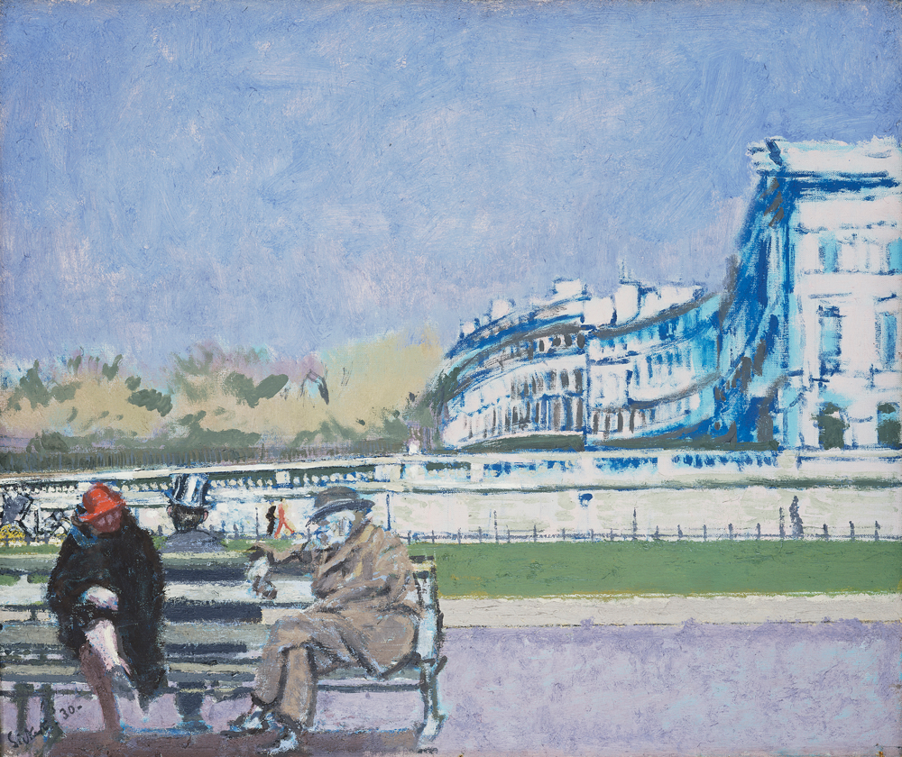
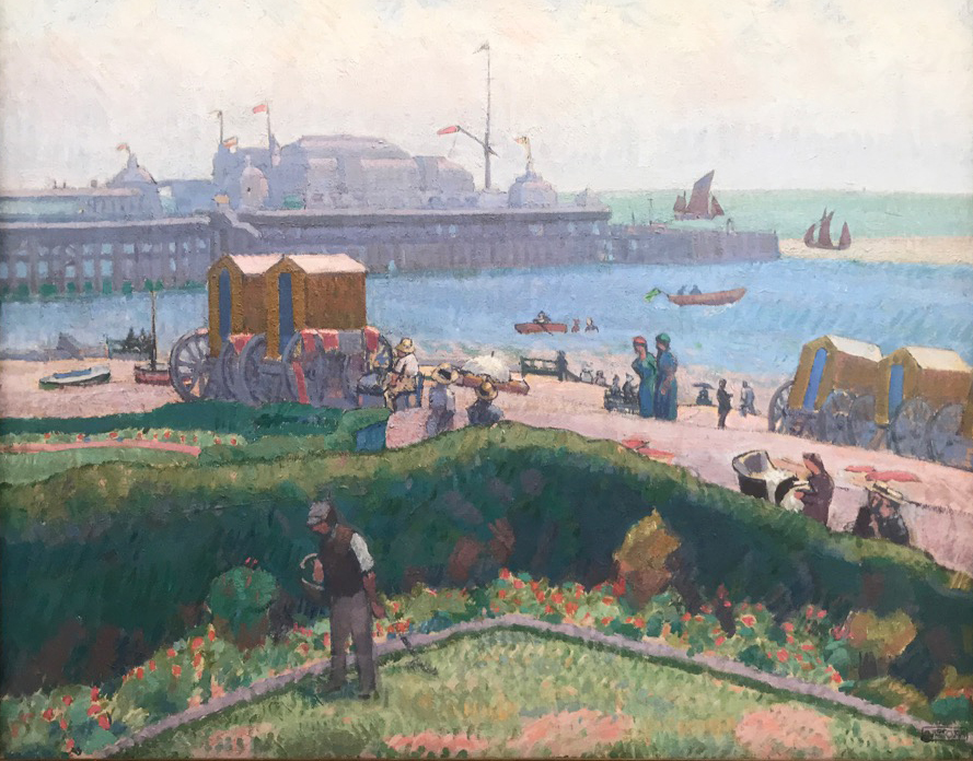
Amongst my favourite paintings in the current exhibition, and one which was in the original show, is Spencer Frederick Gore’s West Pier, Brighton which he painted in 1913. The scene shimmers in the brilliant light illuminated by the bold, blocky use of colour given life by Gore’s use of short, visible brushstrokes built up in textural layers.

Harold Gilman – The Coral Necklace, oil, circa 1914 © RPMT

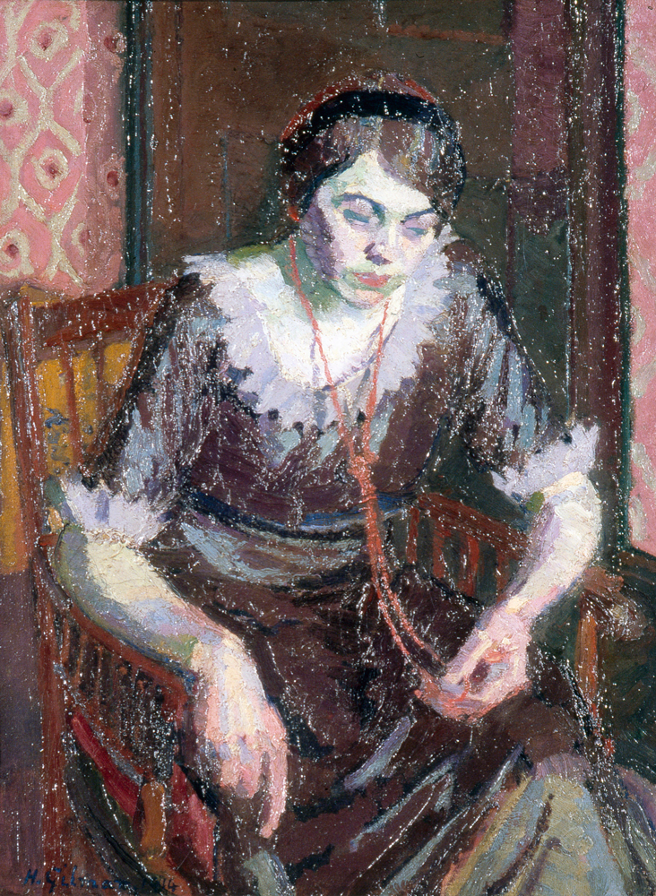
Harold Gilman was also a central figure in the Camden Town Group. In his painting The Coral Necklace he employs a thick impasto applying the paint in generous blobs and smears. The rich pink wallpaper sets the tone of the painting but it is the red coral necklace which focuses our attention on the sitter’s face and hands. The portrait is thought to depict Gilman’s Austrian friend, Mary L. The scene is intimate and reflective.

Over a hundred years after the original landmark exhibition, Down from London: Spencer Gore & Friends revisits the influential work of the Camden Town Group. This beautiful exhibition runs until 11th September 2022. To find out more visit brightonmuseums.org.uk.

Unflinching Exploration, Walter Sickert at Tate

Walter Sickert - Brighton Pierrots © Tate
Walter Sickert – Brighton Pierrots © Tate

Tate Britain’s summer exhibition focuses on the controversial and influential British artist Walter Sickert (1860-1942) who bridged the influence of Paris and Post-Impressionist painting to Britain.

Sickert had studied at the Slade in 1881 under Whistler who had a great influence on him. In 1883 he found himself in Paris where he encountered Edgar Degas, Édouard Manet and Pierre Bonnard. The exhibition has works by Degas and Manet illustrating the affect they had on his work.

Sickert lived in and near Dieppe in the early 1900s. He returned to London in 1905 where he rented two studios. On Saturday afternoons he would keep his studio open to a group of artists which gave rise to the birth of the Fitzroy Street Group. As they were joined by a series of other artists their work came to be described as Camden Town painting. The paintings are often intimate in scale depicting the working class in humble scenes with figurative interiors including nudes as well as townscapes. These themes are readily apparent in the breadth of Sickert’s work. Sickert led the group with an unflinching exploration and depiction of his subjects. In different works throughout the show the artist captures despair, hardship and beauty.

In contrast to Whistler’s slightness of tone and form Sickert employed an increasingly contrasting palette which included deep opaque colours that lend a monumental character to his work. These qualities are apparent in Brighton Pierrots painted in 1915. It is highly original in its composition and use of warm, vivid colours. Unusually Sickert produced two versions of the picture. We view the scene from the side of the stage separated from the audience and the performers. This perspective lends an ambiguity to the painting – the fading daylight broken by the glare of the stage lights. The empty deck chairs allude to losses at the front during the Great War. The sense of the desolation of war pervades.

Walter Sickert – The Front at Hove (Turpe Senex Miles Turpe Senilis Amor), detail, © Tate

The Front at Hove was painted in 1930. Although lighter in palette and tone, the picture is also filled with metaphors which relate to age and decline. The aged figures chatting on a promenade bench are reflected and framed by the crumbling facades of the Regency townhouses in Adelaide Crescent, Hove.

Tate’s exhibition is as unflinching in its exploration of Walter Sickert and his work as the artist was in his exploration and depiction of the world he lived in. Walter Sickert at Tate Britain runs until 8th September. To book tickets and to find out more visit tate.org.uk.

A Postcard from Brighton

Banqueting Room mantel clock by Vuillamy, Royal Collection Trust © Her Majesty Queen Elizabeth II 2020.

This week I am on staycation here in Sussex and I am once again returning to The Royal Pavilion, Brighton to experience ‘A Prince’s Treasure’, this year’s must see exhibition. I cannot impress upon you quite how marvellous this exhibition is.

I meet David Beevers, Keeper of the Royal Pavilion, who has overseen this remarkable collaboration between the Royal Collection Trust and the Royal Pavilion.

I comment on how hard it must have been for David and his team to have had to close and reopen this magnificent exhibition on a number of occasions due to the challenges of Covid-19. He replies by saying how blessed they have been that most of the loans were received before the pandemic broke.

The exhibition showcases a spectacular loan of some 120 decorative works of art from Her Majesty The Queen; pieces that were originally commissioned by the Prince Regent for the Royal Pavilion. It provides a once in a lifetime opportunity for visitors to see these objects of unparalleled magnificence in their original setting. The Pavilion’s exotic, regal interiors come alive in the company of the pieces commissioned for them and further our understanding of the future George IV’s influence and tastes.

David is excited to show me the array of loans some of which have recently arrived.

The Chinese porcelain pagodas, circa 1803, with English additions, at the Royal Pavilion Brighton © HM Queen Elizabeth II, 2019.

The Music Room’s magnificent decoration works in concert with the objects which have fleetingly returned to their original setting.
Your senses are overwhelmed by the spectacle of the line of enormous porcelain pagodas which make sense of and give voice to the scale of this room.
These imposing porcelain objects were acquired in 1803/1804 from China and the dealer Robert Fogg. Fogg supplied the English Spode porcelain bases as well as the gilded bronze bells, dolphins and dogs, and the dragon finials which were subcontracted to B.L. Vulliamy.

I ask David which object most sums up the Royal Pavilion and the exhibition and he takes me to the Banqueting Room. We stand in front of a magnificent mantel clock. He says “The clock’s supercharged chinoiserie reflects the Pavilion style at its confident best. It is as though the painted panels [in the room] have taken three dimensional form.” He describes how the clock was designed by Robert Jones and made by Vuillamy. The Chinese figures echo those painted on the walls. The gilt-bronze foliage was gilded by Fricker and Henderson and seems to allude to an eagle in flight.

David Beevers explains that George IV was the greatest British Royal collector and builder. For some 40 years David’s career at the Royal Pavilion has marked a number of remarkable achievements including the restoration of The Saloon so I am humbled when he concludes “Having these loans here is a highlight of my career.”

Whether you are visiting or on staycation in Sussex like me ‘A Prince’s Treasure’ must be on your list of holiday treats. To find out more and to book your tickets visit www.brightonmuseums.org.uk/royalpavilion.

The Royal Pavilion as George IV Intended

The Orléans Chinese porcelain jars, circa 1710, with later English additions © HM Queen Elizabeth II, 2019

As the New Year dawns we are returning to The Royal Pavilion, Brighton to once again experience ‘A Prince’s Treasure’, an exhibition of international importance which remains on show for much of 2021.

The exhibition showcases a spectacular loan of some 120 decorative works of art from Her Majesty The Queen; pieces that were originally commissioned by the Prince Regent for the Royal Pavilion. It provides a once in a lifetime opportunity for visitors to see these objects of unparalleled magnificence in their original setting. The Pavilion’s exotic, regal interiors come alive in the company of the pieces commissioned for them, and further our understanding of the future George IV’s influence and tastes as Britain became an economic superpower.

I am once again in the company of David Beevers, Keeper of the Royal Pavilion, who has overseen this remarkable collaboration between the Royal Collection Trust and the Royal Pavilion.

I am always delighted to return to the third of the Pavilion’s great state rooms, the Music Room. It was created to reflect George IV’s love of music. The magnificent decoration is not constrained in anyway. It is a masterpiece of one of the King’s chief decorators, Frederick Crace. Under Crace’s instructions Henry Lambert, together with 34 assistants, painted the canvas panels with Chinese scenes in gold against crimson grounds creating the impression of the room being like a huge chinoiserie box. I adore the carved, painted and silvered dragons which shimmer as they support the canvases and blue silk drapes. The chandeliers take the form of spreading lotus flowers adding life and perspective to John Nash’s domed and tented ceiling.

The Chinese porcelain pagodas, circa 1803, with English additions © HM Queen Elizabeth II, 2019

Despite my familiarity with the room David Beevers remarks excitedly that I must look to the right as we enter it. I am unprepared and overwhelmed by the spectacle of the line of six enormous porcelain pagodas which make sense of and give voice to the scale of this room.

These imposing porcelain objects were acquired in 1803/1804 from China and the dealer Robert Fogg. Fogg supplied the English Spode porcelain bases as well as the gilded bronze bells, dolphins and dogs, and the dragon finials which were subcontracted to B.L. Vulliamy.

Flanking the marvellous fireplace are two of the magnificent Orléans jars. Over nine feet high they were used as oil lamps in the corners of the Music Room. George IV was particularly interested in objects associated with the French monarchy and three of the jars bear the arms of Phillipe, duc d’Orleans, Regent of France from 1715-1723. The bases are Spode and the gilded bronze fittings are again from B.L. Vulliamy.

Many of the decorative works of art have not been on public display for over 170 years and are on loan to the Royal Pavilion whilst essential building works in the East Wing of Buckingham Palace take place. They were removed to Buckingham Palace and Windsor Castle by Queen Victoria in 1847 when it was thought that the Royal Pavilion might be demolished. It is wonderful to see them temporarily re-united with their original setting.

‘A Prince’s Treasure’ is 2021’s must see exhibition in Sussex. To find out more and to book your tickets as soon as Tier 4 restrictions are lifted visit www.brightonmuseums.org.uk/royalpavilion.

Place and Identity Expressed in Brighton Aquatints

John Piper – ‘The Royal Pavilion’, plate II, circa 1939

John Piper’s ‘Brighton Aquatints’ was published in late November 1939 just after the outbreak of the Second World War by Gerald Duckworth Ltd. Two-hundred and fifty sets were printed from the original steel-faced copper plates and of these fifty-five sets were hand coloured.

John Piper’s ‘Brighton Aquatints’ rarely comes to auction and is now valued in the thousands. But The Mainstone Press’ 2019 edition, with its excellent introduction and essay by Alan Powers, provides a beautiful and accessible way to enjoy the images and text of the rare original volumes.

Piper revived the early 19th century print making medium of aquatint. At first glance the images with their facing text could appear to record the passing of an age. But the book has a textural, stylized quality which gives expression to deeply held emotions connected with place. It shows Piper’s awareness and interest in modernism and abstraction – a romantic modernism.

The book consist of twelve aquatints of Brighton. The illustrations were printed by the two Alexander brothers who had a basement workshop in Henrietta Street, Covent Garden, London. The watermarks which appear in the paper are irregularly placed and are styled as a hand raised in blessing, a head, said to be that of Christ, and the date 1399.

The process of creating an aquatint involves exposing a plate, usually of copper or zinc, to acid through an applied layer of granulated, melted resin. The acid incises the plate between the granules creating areas of evenly pitted surface. This can be varied by applying additional resin, scraping and burnishing. Different strengths of acids are also employed. When the grains are removed and the plate is printed it results in variations of tone. The effect often resembles watercolours and wash drawings, hence the name Aquatint.

As you know I visited the Royal Pavilion Brighton only a few weeks ago. The scene was reminiscent of Piper’s view of the ‘The Royal Pavilion’ which remains remarkably unchanged from his 1939 aquatint. In his notes Piper describes the building’s extravagant beauty and the great affection in which it is held.

John Piper – ‘Regency Square from the West Pier’, plate III, circa 1939

In ‘Regency Square from the West Pier’ we are reminded of a view now lost to us. John Piper describes how the pier appears like a ‘dazzling white meringue, brittle and sweet…florid and grand as anywhere.’ Regency Square is laid out on a gentle slope in the view beyond.

In some ways John Piper’s Brighton Aquatints is representative of a collective English re-thinking of the role of locality and place in relation to our identity. In the 1930s, as today, there were many who claimed that these things did not matter. But this book speaks persuasively of the importance and value of place to English identity. As we seek to answer the housing needs of our nation I hope that imaginative architecture, and a celebration of the regional and vernacular will speak to our identity as a nation and create homes where our families can flourish.